I have three different types of knitting: a small portable project for travelling; knitting for work, we always need samples and there’s usually a time limit so these are the ones I work on most and finally something I’m making for myself, this is the one that takes the longest.
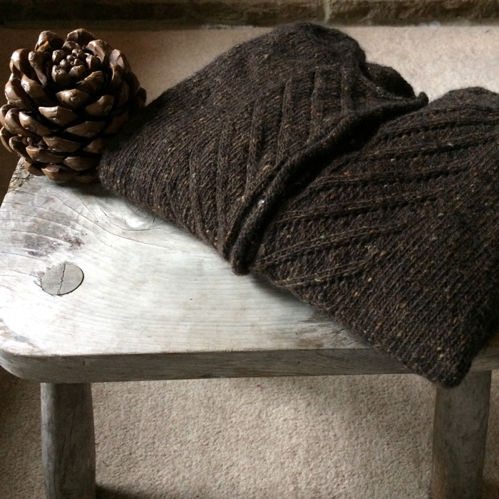
I’ve just finished a Kate cardigan by Libby Jonson in a 4ply merino and mohair single – it’s a trial to see how it wears and I’m always willing to try out new yarns.
I’ve always wanted a Fairisle sleeveless sweater (tank top, pullover?) and that’s going to be my next project for myself. I’ve just got the new Shetland Wool Week Annual and there’s a pattern by Wilma Malcolmson called Seaweed Slipover.
It has a pale background and having grey hair pale colours don’t look good so I need to change the colours around.

In a black and white photo of the pattern there seem to be two of each of the dark, medium and light colours. So I decided to do the same just swapping their positions.
Next I lined up the colours we sell, photographed them and added a black and white filter.
Light colours


Medium colours


Dark colours


For most of the photos I arranged the colours from light to dark but for some reason the last one I did the other way around, really I don’t know why.
I could have spent ages swapping these around (and did) but it gives a rough idea of where the different colours fall.
I wear a lot of blues so I thought grey or brown for the main colour, then I just had to pick some colours I liked from each section.
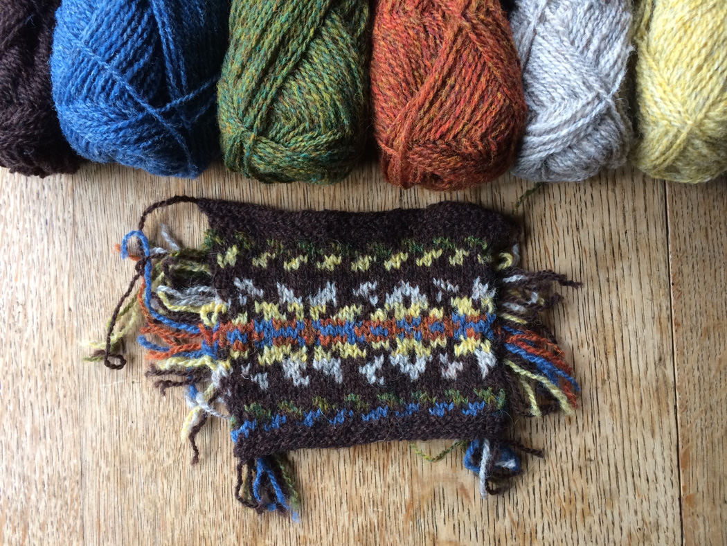
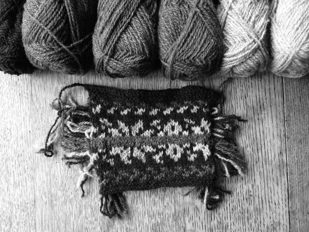
Even though I’d sort of decided on where the colours were going to go I changed them around while I was knitting to get a look I liked.
With the brown sample I started off with the first motif in blue and green but thought the blue was too dark so changed it for yellow for the second repeat.
The band through the middle of the star motif doesn’t have the same contrast as the original but I like the two colours together.
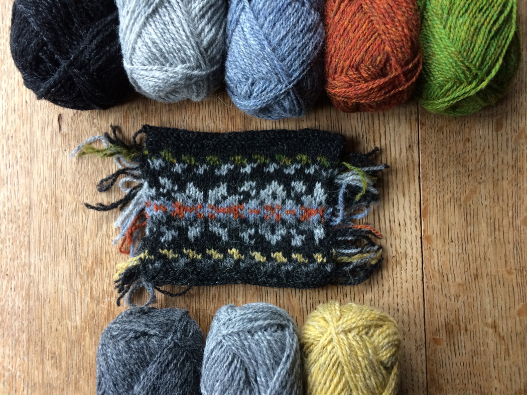
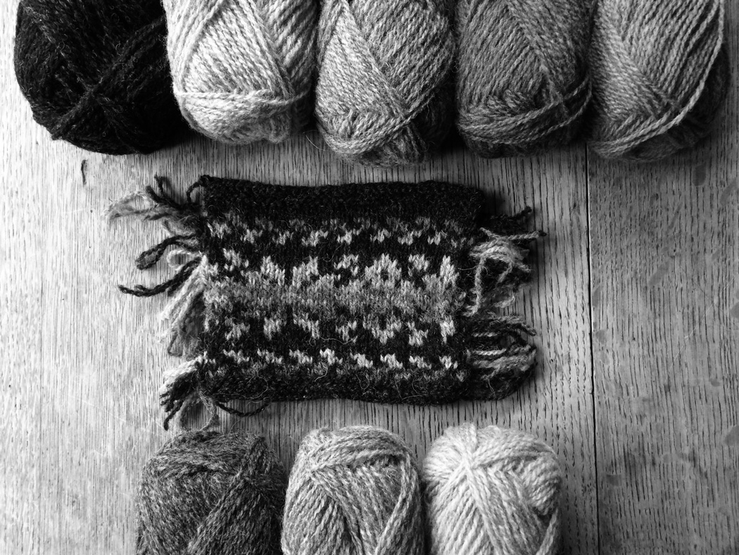
With the grey one, though the yellow contrasted well with the dark grey background, I prefer the green I used in the second repeat. After the band of rust I tried a lighter grey to help make the pattern show up better.
I like the vintage look of the brown version but it might be a bit too retro for me, it would definitely be back in the ’70’s in a tank top, I think I’ll go for the dark grey.

